New Partner: Pam Weil and Associates

Pam Weil Associates Matt Borghi Lansing Web Design

I’m really excited to announce that I’m going to be working very closely with Pam Weil and Associates, a highly-esteemed East Lansing tech firm led by Pam Weil. I started working with Pam and her team in her recent bid for Ingham County Commissioner and it was an incredibly satisfying experience. Pam has a deep knowledge of tech, business and how all of these things can be brought together with digital strategy.

A Deep Bench

One of the most exciting parts about working with Pam Weil and Associates is the deep bench that she’s developed. With years of experience in the East Lansing community and working at Michigan State University, she has designers, network people, system architects and all kinds of tech specialists she can mobilize in just about any type of engagement.

Mission and Purpose

However, the single greatest thing that Pam Weil understands, within the scope of how she runs her firm, Pam Weil and Associates is the soul of an organization. First and foremost, Pam has a motto that she says often: “The single greatest motivator is progress on meaningful work” and she manages her business and help people with that motto always in mind. Pam truly believes that meaningful work is the most important thing that we can be doing as referenced in another quote, from John Berger, that she shared with me:

“As soon as one is engaged in a productive process,” he wrote in an essay on Leopardi, “total pessimism becomes improbable. This has nothing to do with the dignity of labor or any other such crap; it has to do with the nature of physical and psychic human energy…. Work, because it is productive, produces in man a productive hope.”

Here’s a little more about Pam Weil and Associates from their website:

Pam Weil & Assoc. is led by veteran IT leader, Pam Weil, who holds the highest level of of DR/Disaster Recovery certification, as well as a being ITIL certified professional with extensive experience in ITIL/DevOps. With years of experience leading IT operations, management and digital strategy, Pam has an acute knowledge of how all the pieces of IT and digital services come together and the knowledge to glean insights from where they intersect.

Pam Weil & Assoc. has a strong network and a deep bench of experts in all areas of IT and digital services, because of that network we offer a wide range of services to our clients. We specialize in delivering the service and information you need to measure and improve customer satisfaction, optimize your service delivery metrics, support budget requests and to clearly articulate IT’s value to your organization. Our services will allow you to optimize your technology budget’s impact and give you the information you need for high-quality planning and vendor management.

At Pam Weil & Assoc. we use an agile, continuous integration project management methodology to provide meaningful bi-weekly deliverables, as well as continuous status monitoring. Our use of the industry standard ITIL/ Dev Ops framework means our service deliverables will dovetail with future development and vendor supported service aspects.

Our clients consist of small businesses, non-profits and schools/universities throughout Michigan.

Anyway, I’ll still be here, but the strength and diversity of skillsets that comes with my partnering with Pam Weil and Associates is quite exciting and I look forward to the amazing projects that we’ll be taking on.

For web design – Use your backlog!

Screen Shot 2018-04-11 at 8.18.27 AM(Graphic courtesy of of this deck from Reinhart De Lille)


Interesting article here by Guy Ligertwood – 11 Valuable Lessons I Learned While Working in the Real World of UX. The article, as a whole, got me thinking about the difficulties of agile, UX and specifically some thoughts around my early days of of backlog grooming and development.

Guy writes:

“Put it in the backlog and we’ll get back to it (never)”


Sadly, Guy’s not far from the mark. Frequently what goes into the backlog just doesn’t get revisited, mostly because it’s the non-priority, non-MVP (minimum viable product) options that get left behind (See the ‘Backlog Iceberg’ above). Movie editors will talk about losing parts of a story to the cutting room floor; Product manager’s lose stuff that isn’t a priority in the backlog. Backlogs are intended to be living and breathing documents that, especially during the critical start up phase, get much attention, but as market priorities shift, new products are released and organizational focuses evolve, older but not less useful backlog items get neglected. More than once, even right now as I type these lines, I can think of great functionality and features that didn’t make it into a releases I had hoped… the ones that got away… Well, maybe not ‘got away’ because as a Product Manager you have to hold on to those ideas, functionality and features for the right time.

Guy further writes:

“We hear lots about doing the best for the customer and in lots of cases we do, at first. The problem lies when we don’t get back to iterating on designs when delivering becomes more important…”

Again, Guy’s not wrong. As a product manager, you have to always be on your toes — Thinking, grooming and prepping the backlog, because iterations and sprints move quickly and they won’t wait for you. Nailing your cadence, watching the team’s velocity, negotiating stories, etc. are all the things that will keep you prepped and ready to hand off wishlist features and functionality that might not have made it into to early releases. If used consistently, the backlog can be the product manager’s best friend. If we’re doing our jobs as product manager’s well, there will be very few features that ‘got away’…

The problem with “intuitive” design


intuitive_design

Over the years I’ve talked with many people about creating intuitive designs, making something user friendly, usable, even, in the contexts of websites, apps and products. However, the idea of ‘intuitive’ presupposes that one person is able to nail, completely, what is or is not intuitive without any user perspective. Sure, we can can make some basic deductions about a user experience or user expectations based on what we think we know about a user, but really the smallest bit of scrutiny given to the idea of making something intuitive, makes the entire idea fall apart.

Intuition is based on past experience, conscious or unconscious, cumulatively, and determines some level of expectations.

My ability to pick up an iPad, and “intuitively” complete a task will make much more sense to me than if Benjamin Franklin picked up an iPad and tried to complete the same task. I understand user interfaces. I’ve been steeped in a world of human-computer interaction, it’s a modality for the completion of tasks that I understand. Similarly, old Ben Franklin would be much more adept at lighting, servicing and maintaining a whale-oil lamp than I ever could be. My intuitive iPad is not his intuitive whale-oil lamp. Our experiences and our particular epochs are radically different, so, too, what is intuitive is different.

In order to create something that’s intuitive to your users, you have to meet your users where they’re at. How are they using the design? Where are they using the design? When are they using the design? What tasks are they trying to complete? How do they feel about past iterations of yours or a comparable design for completing the same tasks.

The problem with intuitive design is that it’s not really about intuition at all, but about researching your users, their goals, their biases and generally who they are to determine what the best design solution is for them.

Asking for an intuitive design is a cop out.

Do the work and create the design your audience needs.

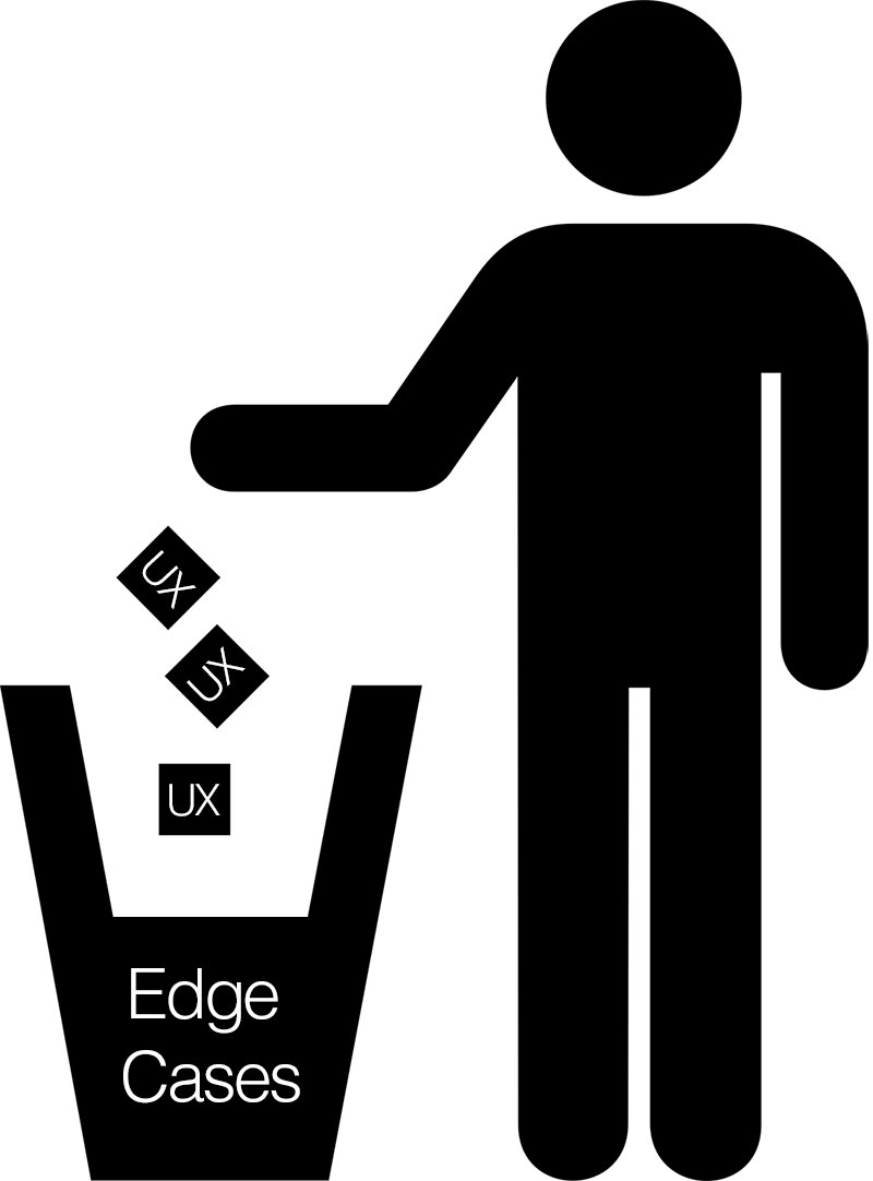
Don’t lose your UX to edge cases

ux_edge-cases

Vital to any user experience are the use cases, but sometimes, it is possible to overthink the design, the product, the software, the website, etc… We’re natural born problem solvers, so when we get in that state of mind it’s easy to find a lot of problems that need solving. The problem here is that we can lose ourselves and our user focus in edge cases.

Edge cases are important and play a vital role in determining how outliers and users in the minority might use your design, but we have to play to the 80/20 design rule: Focusing on the needs of 80% of your users.

That’s not to say that we don’t keep track of that 20% minority, or that we don’t capture use cases and put them in our product backlog, but we can’t prioritize edge cases as if they’re critical to making a design “complete”, when they ultimately prolong the shipping of the design.

Shipping the design gets us valuable user input that’s key to a product evolution and refinement, so getting lost in edge cases not only compromises the timeline, but ultimately focusing on edge cases compromises the user experience for the majority of users.

Focus on the needs of the majority of users, apply the 80/20 rule and design the user experience for the majority of users.

Meet me there… UX design and the user environment

user_experience_environment

User experience design requires an empathic, user-centered design perspective.

You have to meet people where they’re at.

Once you’ve completed your user interviews, and finished your personas, use-cases and journey maps, you have to really get inside the mind of the user.

One of the most difficult tasks of the UX designer is trying to not just get in the mind, but also the physical space of where the user experience is happening. Is it a loud manufacturing facility, is it a cramped commuter train, or is it a quiet health facility?

Knowing where the user experience is happening, getting a sense of that environment, even visiting, if at all possible, is the best way to ensure that the user experience is being designed, not just for the right kinds of users, but also for the right kinds of environments. We do it for different mobile devices, screen resolutions and browsers; why wouldn’t want to also design for the physical space?

The short answer is that we would.

Being an empathic and user-centered UX designer means that you have to capture as much as you can about the user, how and where, they interact with your design — The physical environment shouldn’t get any less consideration than any of the other design criteria.

What did you expect? Self-awareness in UX

self-aware_UX

It’s hard not to get hung up on expectations. When something doesn’t go the way you want, or work the way you thought it should, it’s hard to be cognizant of this and step back. It’s hard for most people, and UX professionals are no different. Somehow, we have to make an appeal to our bigger selves to stop, have the presence of mind to observe what’s going on and then reflect on the expectations.

We have to pause and think about what we expected. Should we have expected whatever outcome didn’t occur? Maybe we ask ourselves what somebody was thinking when they created that app, or that product or that experience. How did they arrive at the conclusions that brought me this experience that you didn’t expect.

When you walk up to a doorknob, and quite unconsciously go to turn it… but it doesn’t turn… You stop, you think about what’s happening, maybe you reef on the door knob, maybe you pull on it, but the unconsciousness of the mundane activity has dissipated and now you’re consciously interacting with the door knob, which is now a problem, that you’re actively engaged in trying to figure out.

When you visit a website, you surf around, maybe you find what you’re looking for, but then unconsciously navigate to the top left corner to click a logo and get back to the homepage, but the logo isn’t a link, or worse there’s no logo, maybe even there’s no home button. Again, you come out of that, almost unconscious, state, awaken for a second and now you’re in problem-solving mode.  How the hell do I get back to the homepage?

These are only two examples, two extremely basic examples.

Now, think about this: The average user (read: most users) won’t go through the trouble-shooting phase, they won’t investigate further. They will, unconsciously, look for another door, X-out of the webpage, delete the app, etc… they’re using a tool to complete a task and the tool isn’t working. Between the speed of life and (almost subconscious) expectations we, as UX professionals, don’t get a lot of do-overs, or second chances with bad first impressions. We have to deliver on expectations from go and keep on delivering right on through.

Sure, there will be cases like Facebook and their bazillion news feed UI changes, and Twitter with all of their timeline changes, but the value for these organizations has been confirmed and delivered, first impressions have been had, so they have some flexibility… to a point. If you screw around with the users enough times you’re going to have an Internet Explorer situation on your hands and most people are just going to give up and move just as soon as they can, veritable monopolies notwithstanding.

So, in your own life, try to take notice. Try to be aware of your expectations. Are things working the way you want them to be? If not, what did you expect and why? This isn’t an article about user research or user testing, but really a an article on self-awareness, because that self-awareness is the greatest asset that a UX professional can have.

The privilege of service

usage_ux_service

Today, I began thinking about a blog post that I wrote onmy mattborghi.com website back in 2009 – The tool of choice, the privilege of service – It feels like a dog’s age since I wrote down those words, and it was well before the idea of ‘user experience design’ was getting used as much as it does today (corroberated by Google Trends, below), but the ideas there were as true then as they are now.

uxd_google_trend

Let me set the stage…

Google was the king of search, kind of like they are now. Microsoft had just released Bing and they were working very hard to knock Google off the search mountain. Many folks thought that they would succeed. As a heavy Google user then, well before mobile/Android ubiquity, I didn’t think Microsoft would be able to pull it off.

Back then, I wrote:

The thing that’s easy to forget is Google did next to no marketing for their search (interesting Salon article from 1999 that touches on this a bit, as well as a 1998 Cnet article here). I know for me, back in 1999 or 2000, numerous people recommended that I use Google, as I had been a big user of Yahoo! for everything. Eventually, Google became my search tool of choice, not just for me, but for a lot of folks. Was it because it worked well? Was it because it was lean and uncluttered? Was it because it was quick? Honestly, it’s probably some combination, but I know that value that Google offered came to me through word-of-mouth, and when I tried the tool, it delivered as promised. It was no frills, just a simple tool that worked well.

What I wrote here really is the essence of what user experience design is all about. Google worked well, it was lean, uncluttered and quick; It wasn’t bogged down with ads or Flash graphics… It just worked, quickly and the results were good. Google understood user experience and user-centered design, whether intuitively, or otherwise, and that was the tool that they brought to the marketplace.

This isn’t new news, but rather a history lesson, of sorts, to remember the roots of user experience and the benefits of user-centered design.

More from 2009:

Again, Google did very little marketing; they put something out there that worked, and people came to it. Clearly, they knew what people wanted, and how to add value… to serve is a privilege, and if your tool is chosen, then it’s bonus and bonus! Create the tool of choice, and cherish the privilege of service.

The fact is any company that stops thinking about, or doesn’t consider their, customer is going to go out of business; whether they’re selling Web services or hot dogs…

As true today, in 2016, as it was in 2009, I’m reminded that as a designer and then a design manager, my goal was always to ensure that we were serving the users, to ensure that we were delivering the best possible user and customer experience possible by delivering the best possible solution. That means that you have to be conservative and not just jump on every new trend. Try things out and see what works. Of course, there’s a balance between this and analysis paralysis, but you don’t want to be constantly throwing new tools at your users or your customers… vet the tools with research and always try to undertake a user-centered design approach. It’s not always easy, as simplicity is almost always complicated, especially when you’re working with pre-web companies, but the privilege to serve is a great and noble pursuit. And if you get your chance, it just might make you one of the richest and most successful organizations in the world.

You don’t know me – Why user interviews matter

user_interview

At USAGE, one of our favorite things to do, when doing UX evaluations, is to talk to actual users. But it wasn’t so long ago, in a land pretty much where we’re sitting right now, that considered user interviews around website usage inconceivable.

Them: ‘Our website users don’t want to talk to us about how they’re using the website! That’s crazy! Just make the website pop!

Us: “Umm… Ok.

Sigh… how many times have we heard that… Isn’t it great that times have changed and folks now understand the value of talking to your users; in fact a whole industry is growing around the idea. Excellent!

UX is growing and we’re excited to be part of it. Generally, we focus on the user experience of human-computer interaction, but as time goes on our user relationship with all manners of product and service is being scrutinized, evaluated and reconsidered. User interviews are a really great way to get to the core issues of their usage, but, as Jakob Nielsen, the Father of Usability states:

“What users say and what they do are different…”

It’s true that what users say and what they do are different, but it’s still one of the best ways to get into the mind of the user.

Admittedly, user interviews are more art than science and this is one of the reasons that some folks like them, while other folks would prefer to use moderated and unmoderated remote user testing, or some other form of quantitative testing — the classic qualitive (user interviews) vs. quantitive (A/B testing) research dilemma. At USAGE, we prefer both and take a mixed-method approach. The science is nice, but it’s kind of cold, we prefer the warmth of human interaction; this approach creates checks & balances that gives a space for the quantitative information but allows it to be tempered by qualitative information.

If you haven’t done a lot of user interviews they can be tricky to get off the ground, but Charles Liu gives some great pointers in his article Never Ask What they Want – 3 Better Questions to Ask In User Interviews, where he suggests these three questions:

  • What are you trying to get done? (Gather context)
  • How do you currently do this? (Analyze workflow)
  • What could be better about how you do this? (Find opportunities)

These are great questions to get the conversation flowing. You are quickly able to determine what a user’s expectations are around how something works, but also how they’d like it work. As the user talks about their experiences, you get an insight into their world and you’re able to get a feel for what it’s like to walk in their shoes. In our experience this is the best possible way to get to know your users. While a mixed approach is necessary and pros & cons abound, there’s no substitute for getting to know your users and having that one on one relationship with them.

The 10 promises of user experience design

user_experience

This article began with me referencing a variety of sites and other articles about user experience. I began borrowing ideas that I was going to attribute here, but as I did this, I realized that none of what I found, for me, truly captured the feelings we have at USAGE where user experience is concerned. Much has been written about UX, there’s the oft-referenced Nielsen Norman Group site, and their articles about UX, I also found a great Slideshare presentation that framed Walt Disney as the first UX designer by @josephdickerson a UX Lead at Microsoft, as well as dozens of “commandments” and rules regarding UX, but when I finally put pen to paper, or fingers to keys, as it were, I just didn’t feel like any of those truly captured the promises of UX the way that we view them here at USAGE. So, here goes — The 10 Promises of User Experience design:

1.) Know your users
Knowing your users is rule numero uno for a reason. If you don’t know your users from user interviews, personas, testing, etc… then you’re shooting in the dark. You have to cater the user experience to their usage and their needs.

2.) Focus on your users needs
Focusing on the user needs is the primary thing that one gets out of user and usage research. Understand the user, what they want, how they’re trying to accomplish tasks and what might make their lives a little easier and build that into the design.

3.) Design for the user
Like a series of building blocks, you can’t design for the user if you don’t know your users and their needs. When you know who your users are and what they need, designing for them is a cinch. Also, when you know you’re designing something that will help and serve your users it’s also very satisfying work, but that’s just a sweet little bonus!

4.) Make it seamless
So, you know your users, you know their needs and you’ve got a design that pretty much nails it on all accounts… at least until you’re given some third-party tool that must be integrated, can’t be customized and sticks out like a sore thumb. You have to make the experience as seamless as possible. You’ll note that the title of this bullet isn’t make it absolutely seamless, because that’s impossible, and, anyway, relative… the definition of seamless resides in intention… When you’re working on the user experience, put simply, you do the best you can… and that’s not always perfect.

5.) Set user expectations early on and maintain them consistently
There are many things that you can’t control, but if you set expectations early and do this consistently you can establish a positive user experience. Again, nothing’s perfect, but there are ways that allude to perfection even if you’re not able to achieve it absolutely.

6.) Don’t make users work to figure things out
This one is an allusion to the very first book we here at USAGE read on Usability, Steve Krug’s classic Don’t Make Me Think: A Common Sense Approach to Web Usability. The title of that book pretty much says it all, but I’ve added a bit of specificity to it. If something is designed well then your users won’t have to figure it out and there won’t be much of a learning curve. This could really be part of the next bullet about instructions.

7.) Keep instructions to a minimum
We here at USAGE don’t like designs that require instructions, whether it be a website, a mobile app, or IKEA furniture… Life is short, time is at a premium, we have to do the heavy lifting for users and get the design to a place where they can walk up and do what they need to do. Specifically, as human-computer interaction increases its those products that do this in the first release that will rise to the top.

8.) Measure, Test and Refine
How do you get your product to be highly usable by the first release, well, that’s where measurement, testing and refinements come in. Whether you’re in a pre-launch phase or have a website or app that’s been out there a while, you have to be measuring, testing and refining based on that research. In fact, this brings to mind one of our favorite quotes from W. Edwards Deming, the father of quality management who said: “You can’t manage, what you can’t measure.” Measurement is a key to success and testing is just another form measurement. Take all of this and use it to make refinements.

9.) Know what you’re good at and focus on that
Knowing what you’re good at when considering user experience might seem a little counter-intuitive, because of course, you want to serve your users, but just like McDonald’s doesn’t make cars, and Ford doesn’t make hamburgers, don’t try to be something you’re not. Do what you do well and hire out the rest to folks that do it better.This probably fits somewhere within creating a seamless experience, but we felt it was important enough to stand on its own. Play to your strengths.

10.) UX is iterative – Repeat steps 1-9
Wash. Rinse. Repeat. User experience design is iterative; it doesn’t end. It continues on and on for the life of a product or service. Repeat these steps and you’ll be fulfilling the promises of experience design and you’ll always be doing your best to ensure that you’re creating the best possible experience for your users. After all, perfection may be elusive, but making something better is well within reach.

What the heck is web usability, anyway?

Without Jakob Nielsen’s pioneering work on usability and his undying passion for it, USAGE might not even be around, today. Ok. Probably, we wouldn’t be around at all. So, it makes sense to us that our first blog post on the brand, spankin’ new USAGE website be dedicated to Jakob Nielsen’s thoughts on usability and usability heuristics.

In Jessica Miller’s excellent post, How Jakob Nielsen Changed the Face of Usability from the Usability Lab website she notes, quite aptly, that:

“Chris Kringle is the father of Christmas,
Abner Doubleday is the father of Baseball,
Enzo Ferrari is the father of the Supercar.
Jakob Nielsen is the father of Usability.”

It’s true, and it’s pretty much that simple. Jakob Nielsen graduated with a degree in human-computer interaction in the early 1980s, a time very different from now with regard to said human-computer interaction. Personal computers existed, but really this was the period of the mainframe supercomputers that took up entire floors of massive facilities, a fact that makes Nielsen’s ability to forecast what was to come quite exceptional, even if that vision is overshadowed by so much of his other pioneering work; particularly the work he’s done with his Nielsen Norman Group, where they’ve, almost, single-handedly evangelized and spread the gospel of usability and user experience in the age of personal computing, so it’s with that that we dig into one of our favorite areas, the definition of usability and usability heuristics, or as Jakob Nielsen put it, “broad rules of thumb”… rather than specific usability guidelines…

Jakob Nielsen defines the 5 components of usability, thusly:

  • Learnability: How easy is it for users to accomplish basic tasks the first time they encounter the design?
  • Efficiency: Once users have learned the design, how quickly can they perform tasks?
  • Memorability: When users return to the design after a period of not using it, how easily can they reestablish proficiency?
  • Errors: How many errors do users make, how severe are these errors, and how easily can they recover from the errors?
  • Satisfaction: How pleasant is it to use the design?

He goes further to talk about those ‘broad rules of thumb,’ or the usability heuristics, as:

Visibility of system status
The system should always keep users informed about what is going on, through appropriate feedback within reasonable time.

Match between system and the real world
The system should speak the users’ language, with words, phrases and concepts familiar to the user, rather than system-oriented terms. Follow real-world conventions, making information appear in a natural and logical order.

User control and freedom
Users often choose system functions by mistake and will need a clearly marked “emergency exit” to leave the unwanted state without having to go through an extended dialogue. Support undo and redo.

Consistency and standards
Users should not have to wonder whether different words, situations, or actions mean the same thing.

Error prevention
Even better than good error messages is a careful design which prevents a problem from occurring in the first place. Either eliminate error-prone conditions or check for them and present users with a confirmation option before they commit to the action.

Recognition rather than recall
Minimize the user’s memory load by making objects, actions, and options visible. The user should not have to remember information from one part of the dialogue to another. Instructions for use of the system should be visible or easily retrievable whenever appropriate.

Flexibility and efficiency of use
Accelerators — unseen by the novice user — may often speed up the interaction for the expert user such that the system can cater to both inexperienced and experienced users. Allow users to tailor frequent actions.

Aesthetic and minimalist design
Dialogues should not contain information which is irrelevant or rarely needed. Every extra unit of information in a dialogue competes with the relevant units of information and diminishes their relative visibility.

Help users recognize, diagnose, and recover from errors
Error messages should be expressed in plain language (no codes), precisely indicate the problem, and constructively suggest a solution.

Help and documentation
Even though it is better if the system can be used without documentation, it may be necessary to provide help and documentation. Any such information should be easy to search, focused on the user’s task, list concrete steps to be carried out, and not be too large.

These 5 components of usability and these 10 usability heuristics create the bedrock for what we do here at USAGE and how we evaluate the sites that we work on. This is high level, of course, and there are many considerations when considering various platforms and how user-friendly something is, along with many other specific considerations, but at the core of it Jakob Nielsen’s work is a fundamental ingredient in the secret sauce here at USAGE; it’s this knowledge that we’ve used with customer’s around Lansing, Michigan and throughout the world for over 15 years.