The Evolution of UX

As far as web design in Lansing goes, I consider myself one of the most vocal advocates for user experience design. When I saw Ian Armstrong’s article on the evolution of UX, I was sure that other folks doing web design in Lansing would want to learn more –  Check out Ian’s article here. Additionally, I will add a few of my own points based on my reading of the article, but a full read is a must.

lean ux design lansing

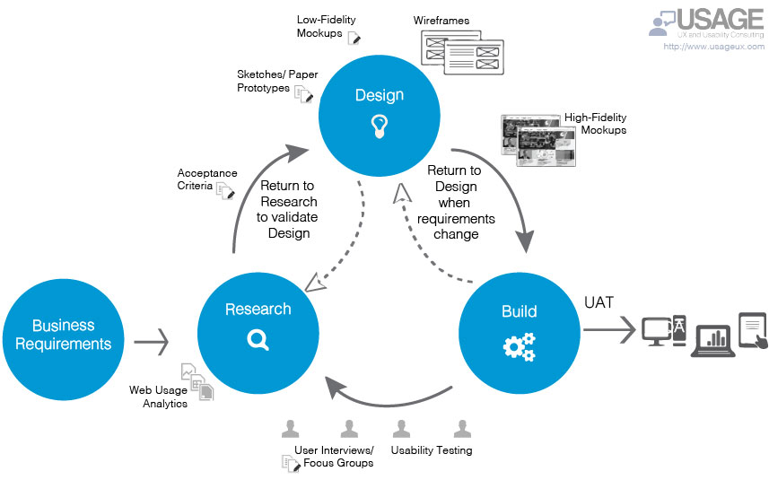
Ian states that “in its purest form, UX Design is waterfall based.” These days, in most circles where folks are talking about UX, ‘waterfall’ is a dirty word that hearkens back to rigid PMBOK processes and exhaustingly long requirements gathering sessions, but Ian’s absolutely right. You have to get a sense of requirements, gather perspectives, mock things up, test out assumptions, wash, rinse, repeat. It’s waterfall. There’s no way around it.

Ian nails one of the key problems with being outcome based, what we work towards with agile vs. requirements based. This is a conundrum that many of have faced and still work to reconcile:  “Whereas classic UX is requirements based, Lean UX is outcome based… Designers found themselves under immense pressure to fill a sprint backlog before they really understood what they were building. As a result, a lot of development cycles got burned on features that never made it into the final product.”

So much development and rework lost trying to anticipate product needs… <sigh>

I’ve read a lot about the Google Ventures Design Sprint, and attended a session at an O’Reilly Design conference where they talked about it, but even then, Ian’s explanation is as succinct and spot-on as any I’ve come across:

“Google Ventures conceived the design sprint, which allowed teams to rapidly define and test a low-fidelity prototypes. This jump-started the Lean UX cycle on emerging product teams and effectively eliminated the waste and rework problem.”

I’ll put a pin it there. Check out Ian’s original article.

If you’re looking for web design in Lansing that puts your user’s experience at the center of their work, then get in touch today.

Lean UX and agile – The one-two punch to quickly knock out great work!

usage_lean_ux_agile_diagram

It’s probably because it’s something I do everyday. I don’t think much about it. Or, maybe, I don’t want to think much about it, because day in, day out, it’s where my focus is. However, I do think that it’s supremely important… I’m talking about integrating UX into agile.

One day I’ll probably write a book about it. I love giving practical advice and sharing my experiences, in fact, that’s one of things about agile that I really love, the community-based, open source aspect of the community around agile. Whether you’re looking at scrum, kanban, scrumban, or something else, agile is a great way of working with your development team and it’s also excellently positioned to take advantage of UX practices.

Specifically, (WARNING: Much jargon ahead) I’m a fan of Lean UX, say, as opposed to, agile UX, which honestly, it looks like it is falling out of favor for some of the reasons that the Nielsen/Norman group captured here in their article Doing UX in an agile world, specifically:

…most teams don’t conduct user research on a consistent basis, if at all. People cite tight deadlines and staffing shortages as reasons for deficiencies in user-centered activities.

Research and user testing are two areas that are very difficult to integrate into agile UX. Lean UX, on the other hand, considers this, and in some ways is really an agile UX 2.0. This is important, because the need for that research and testing to happen in real time is super important to the ongoing design and development process. Unlike a waterfall approach, there usually haven’t been requirements or JAD (joint application design) meetings; instead, you start with a basic road map, some use-cases, a couple user stories and get to work. Lean UX thrives in this situation.

Ok, I say, Lean UX thrives… yes, that’s true, BUT… teams have to get used to working with one another and they have to round off the rough edges and bad habits, whether of the development or the interpersonal variety. Lean UX and agile don’t leave a lot of margin for getting mired in unnecessary details and some of the interpersonal issues that may pop up when a team is just getting started. Nevertheless, when it comes together, and when the gelling starts, the team’s pace and work can be exceptional!

I find Lean UX or the idea of UX that can work at the speed of agile to be very exciting, especially if you’ve ever been involved in a waterfall development project or something that was just slow moving. Lean UX and agile are the one-two punch to quickly knock out great work!

UX simplicity is an iterative process


ux_simplicity

When it comes to design, reducing something to its most basic parts is not just a design or aesthetic discipline, but it’s also the discipline of looking at what’s needed rather than trying to imbue the design with what you want.

The best designers know this, maybe intuitively, because at the core of the work they’re doing is the hope that a design, this thing birthed from one’s intellect, takes on a physical life of its own, is used and maybe, if you’re super lucky, brings joy to the user.

So, simplicity, like complexity is all about which direction you take the iterations in. Do you want something with lots features, buttons, screens, etc.? Or, do you want something with a few critical functions that are intuitive, straight-forward and easy to use?

This is the fundamental dilemma of design: Provide many features, which, historically, has implied a greater value, or to minimize, giving only the most important features and perfecting them to ensure the best possible experience.

With each design iteration there’s change, growth and refinement; Simplicity leaves room for things to evolve, organically — I think that perfection is a phantom, but iterations will be what gets you closest to a more perfect design.

The problem with “intuitive” design


intuitive_design

Over the years I’ve talked with many people about creating intuitive designs, making something user friendly, usable, even, in the contexts of websites, apps and products. However, the idea of ‘intuitive’ presupposes that one person is able to nail, completely, what is or is not intuitive without any user perspective. Sure, we can can make some basic deductions about a user experience or user expectations based on what we think we know about a user, but really the smallest bit of scrutiny given to the idea of making something intuitive, makes the entire idea fall apart.

Intuition is based on past experience, conscious or unconscious, cumulatively, and determines some level of expectations.

My ability to pick up an iPad, and “intuitively” complete a task will make much more sense to me than if Benjamin Franklin picked up an iPad and tried to complete the same task. I understand user interfaces. I’ve been steeped in a world of human-computer interaction, it’s a modality for the completion of tasks that I understand. Similarly, old Ben Franklin would be much more adept at lighting, servicing and maintaining a whale-oil lamp than I ever could be. My intuitive iPad is not his intuitive whale-oil lamp. Our experiences and our particular epochs are radically different, so, too, what is intuitive is different.

In order to create something that’s intuitive to your users, you have to meet your users where they’re at. How are they using the design? Where are they using the design? When are they using the design? What tasks are they trying to complete? How do they feel about past iterations of yours or a comparable design for completing the same tasks.

The problem with intuitive design is that it’s not really about intuition at all, but about researching your users, their goals, their biases and generally who they are to determine what the best design solution is for them.

Asking for an intuitive design is a cop out.

Do the work and create the design your audience needs.

Don’t lose your UX to edge cases

ux_edge-cases

Vital to any user experience are the use cases, but sometimes, it is possible to overthink the design, the product, the software, the website, etc… We’re natural born problem solvers, so when we get in that state of mind it’s easy to find a lot of problems that need solving. The problem here is that we can lose ourselves and our user focus in edge cases.

Edge cases are important and play a vital role in determining how outliers and users in the minority might use your design, but we have to play to the 80/20 design rule: Focusing on the needs of 80% of your users.

That’s not to say that we don’t keep track of that 20% minority, or that we don’t capture use cases and put them in our product backlog, but we can’t prioritize edge cases as if they’re critical to making a design “complete”, when they ultimately prolong the shipping of the design.

Shipping the design gets us valuable user input that’s key to a product evolution and refinement, so getting lost in edge cases not only compromises the timeline, but ultimately focusing on edge cases compromises the user experience for the majority of users.

Focus on the needs of the majority of users, apply the 80/20 rule and design the user experience for the majority of users.

UX isn’t just for designers

Screen Shot 2016-04-11 at 9.28.20 PM

To non-designers user experience can a very abstract concept. We’re lucky to have this empathic perspective of walking a mile in somebody else’s use cases, but mostly, folks don’t get it. It’s kind of like trying to explain to your parents what you do as a user experience professional… ‘what the hell is that?’ They might say back to you… or they might just nod in feigned acknowledgement… Either way, just like having empathy for users, we need to have empathy for those folks who don’t understand what UX is all about.

It’s kind of exciting, really, because it’s our job to teach them about UX.

Where teaching UX is concerned, I’ve found that nothing works quite as well as a ‘show don’t tell’ approach. Teaching UX is even better if you can get lay-people involved in some kinds of interactive exercises around UX.

I’m reluctant to say something is easy, but teaching the value of UX is, well… kind of easy. In nearly every instance where I’ve had to introduce UX folks have been pretty quick to get what UX means and how it could benefit users and an organization alike. After all, who hasn’t had to work with crummy software, navigate a horrible website or complete a task through an ill-conceived smartphone app? These experiences are ubiquitous and universal in a world driven by human-computer interactions.

Two simple, high level, ways to teach a lay-person UX might be to:

  1. Make a series of paper prototype user interfaces for paying a bill or ordering a book online — a straightforward interaction that should have only a few clicks;
  2. Walk through a simple purchase on Amazon or eBay, narrating the steps and what’s happening, from a UX perspective, as you go.

Each of these simple, low-tech, steps, highlights in context, what the user experience is and what its benefits could be. Exercises like these bridge the gap of abstraction, making something conceptual into something practical. When you make a connection for a business person or some other non-designer, it’s magical; these Aha! Moments make the teaching of UX very satisfying and a lot of fun.

While UX is quickly achieving buzzword status, it’s a real and necessary discipline whose time has come. UX, after its vogue period, will stop being “cool” and will just be… a mature operational practice taken for granted like automobile safety features or tamper-proof packaging, so it’s our job to be teachers and stewards of UX, not just how it can benefit our organizations, but how it can benefit the world. We may get to a time where user interfaces cease to exist, but UX will be at the heart of that, too.

What did you expect? Self-awareness in UX

self-aware_UX

It’s hard not to get hung up on expectations. When something doesn’t go the way you want, or work the way you thought it should, it’s hard to be cognizant of this and step back. It’s hard for most people, and UX professionals are no different. Somehow, we have to make an appeal to our bigger selves to stop, have the presence of mind to observe what’s going on and then reflect on the expectations.

We have to pause and think about what we expected. Should we have expected whatever outcome didn’t occur? Maybe we ask ourselves what somebody was thinking when they created that app, or that product or that experience. How did they arrive at the conclusions that brought me this experience that you didn’t expect.

When you walk up to a doorknob, and quite unconsciously go to turn it… but it doesn’t turn… You stop, you think about what’s happening, maybe you reef on the door knob, maybe you pull on it, but the unconsciousness of the mundane activity has dissipated and now you’re consciously interacting with the door knob, which is now a problem, that you’re actively engaged in trying to figure out.

When you visit a website, you surf around, maybe you find what you’re looking for, but then unconsciously navigate to the top left corner to click a logo and get back to the homepage, but the logo isn’t a link, or worse there’s no logo, maybe even there’s no home button. Again, you come out of that, almost unconscious, state, awaken for a second and now you’re in problem-solving mode.  How the hell do I get back to the homepage?

These are only two examples, two extremely basic examples.

Now, think about this: The average user (read: most users) won’t go through the trouble-shooting phase, they won’t investigate further. They will, unconsciously, look for another door, X-out of the webpage, delete the app, etc… they’re using a tool to complete a task and the tool isn’t working. Between the speed of life and (almost subconscious) expectations we, as UX professionals, don’t get a lot of do-overs, or second chances with bad first impressions. We have to deliver on expectations from go and keep on delivering right on through.

Sure, there will be cases like Facebook and their bazillion news feed UI changes, and Twitter with all of their timeline changes, but the value for these organizations has been confirmed and delivered, first impressions have been had, so they have some flexibility… to a point. If you screw around with the users enough times you’re going to have an Internet Explorer situation on your hands and most people are just going to give up and move just as soon as they can, veritable monopolies notwithstanding.

So, in your own life, try to take notice. Try to be aware of your expectations. Are things working the way you want them to be? If not, what did you expect and why? This isn’t an article about user research or user testing, but really a an article on self-awareness, because that self-awareness is the greatest asset that a UX professional can have.