UX simplicity is an iterative process


ux_simplicity

When it comes to design, reducing something to its most basic parts is not just a design or aesthetic discipline, but it’s also the discipline of looking at what’s needed rather than trying to imbue the design with what you want.

The best designers know this, maybe intuitively, because at the core of the work they’re doing is the hope that a design, this thing birthed from one’s intellect, takes on a physical life of its own, is used and maybe, if you’re super lucky, brings joy to the user.

So, simplicity, like complexity is all about which direction you take the iterations in. Do you want something with lots features, buttons, screens, etc.? Or, do you want something with a few critical functions that are intuitive, straight-forward and easy to use?

This is the fundamental dilemma of design: Provide many features, which, historically, has implied a greater value, or to minimize, giving only the most important features and perfecting them to ensure the best possible experience.

With each design iteration there’s change, growth and refinement; Simplicity leaves room for things to evolve, organically — I think that perfection is a phantom, but iterations will be what gets you closest to a more perfect design.

The problem with “intuitive” design


intuitive_design

Over the years I’ve talked with many people about creating intuitive designs, making something user friendly, usable, even, in the contexts of websites, apps and products. However, the idea of ‘intuitive’ presupposes that one person is able to nail, completely, what is or is not intuitive without any user perspective. Sure, we can can make some basic deductions about a user experience or user expectations based on what we think we know about a user, but really the smallest bit of scrutiny given to the idea of making something intuitive, makes the entire idea fall apart.

Intuition is based on past experience, conscious or unconscious, cumulatively, and determines some level of expectations.

My ability to pick up an iPad, and “intuitively” complete a task will make much more sense to me than if Benjamin Franklin picked up an iPad and tried to complete the same task. I understand user interfaces. I’ve been steeped in a world of human-computer interaction, it’s a modality for the completion of tasks that I understand. Similarly, old Ben Franklin would be much more adept at lighting, servicing and maintaining a whale-oil lamp than I ever could be. My intuitive iPad is not his intuitive whale-oil lamp. Our experiences and our particular epochs are radically different, so, too, what is intuitive is different.

In order to create something that’s intuitive to your users, you have to meet your users where they’re at. How are they using the design? Where are they using the design? When are they using the design? What tasks are they trying to complete? How do they feel about past iterations of yours or a comparable design for completing the same tasks.

The problem with intuitive design is that it’s not really about intuition at all, but about researching your users, their goals, their biases and generally who they are to determine what the best design solution is for them.

Asking for an intuitive design is a cop out.

Do the work and create the design your audience needs.

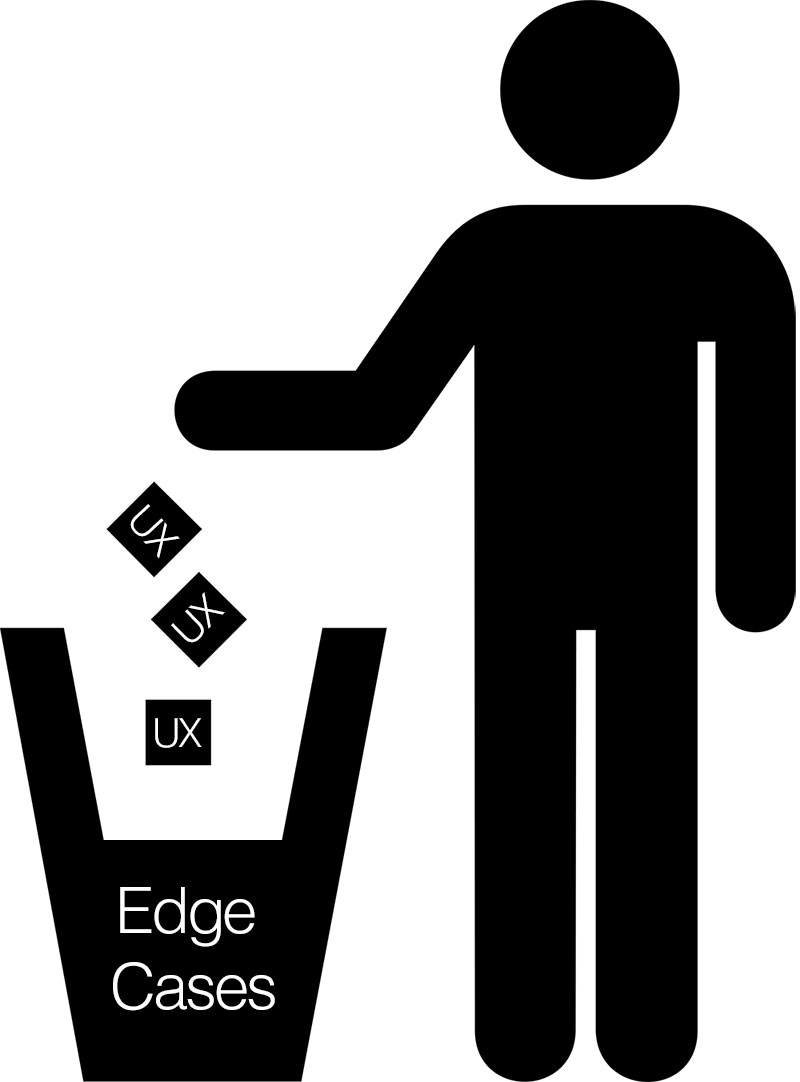
Don’t lose your UX to edge cases

ux_edge-cases

Vital to any user experience are the use cases, but sometimes, it is possible to overthink the design, the product, the software, the website, etc… We’re natural born problem solvers, so when we get in that state of mind it’s easy to find a lot of problems that need solving. The problem here is that we can lose ourselves and our user focus in edge cases.

Edge cases are important and play a vital role in determining how outliers and users in the minority might use your design, but we have to play to the 80/20 design rule: Focusing on the needs of 80% of your users.

That’s not to say that we don’t keep track of that 20% minority, or that we don’t capture use cases and put them in our product backlog, but we can’t prioritize edge cases as if they’re critical to making a design “complete”, when they ultimately prolong the shipping of the design.

Shipping the design gets us valuable user input that’s key to a product evolution and refinement, so getting lost in edge cases not only compromises the timeline, but ultimately focusing on edge cases compromises the user experience for the majority of users.

Focus on the needs of the majority of users, apply the 80/20 rule and design the user experience for the majority of users.

Meet me there… UX design and the user environment

user_experience_environment

User experience design requires an empathic, user-centered design perspective.

You have to meet people where they’re at.

Once you’ve completed your user interviews, and finished your personas, use-cases and journey maps, you have to really get inside the mind of the user.

One of the most difficult tasks of the UX designer is trying to not just get in the mind, but also the physical space of where the user experience is happening. Is it a loud manufacturing facility, is it a cramped commuter train, or is it a quiet health facility?

Knowing where the user experience is happening, getting a sense of that environment, even visiting, if at all possible, is the best way to ensure that the user experience is being designed, not just for the right kinds of users, but also for the right kinds of environments. We do it for different mobile devices, screen resolutions and browsers; why wouldn’t want to also design for the physical space?

The short answer is that we would.

Being an empathic and user-centered UX designer means that you have to capture as much as you can about the user, how and where, they interact with your design — The physical environment shouldn’t get any less consideration than any of the other design criteria.

You don’t know me – Why user interviews matter

user_interview

At USAGE, one of our favorite things to do, when doing UX evaluations, is to talk to actual users. But it wasn’t so long ago, in a land pretty much where we’re sitting right now, that considered user interviews around website usage inconceivable.

Them: ‘Our website users don’t want to talk to us about how they’re using the website! That’s crazy! Just make the website pop!

Us: “Umm… Ok.

Sigh… how many times have we heard that… Isn’t it great that times have changed and folks now understand the value of talking to your users; in fact a whole industry is growing around the idea. Excellent!

UX is growing and we’re excited to be part of it. Generally, we focus on the user experience of human-computer interaction, but as time goes on our user relationship with all manners of product and service is being scrutinized, evaluated and reconsidered. User interviews are a really great way to get to the core issues of their usage, but, as Jakob Nielsen, the Father of Usability states:

“What users say and what they do are different…”

It’s true that what users say and what they do are different, but it’s still one of the best ways to get into the mind of the user.

Admittedly, user interviews are more art than science and this is one of the reasons that some folks like them, while other folks would prefer to use moderated and unmoderated remote user testing, or some other form of quantitative testing — the classic qualitive (user interviews) vs. quantitive (A/B testing) research dilemma. At USAGE, we prefer both and take a mixed-method approach. The science is nice, but it’s kind of cold, we prefer the warmth of human interaction; this approach creates checks & balances that gives a space for the quantitative information but allows it to be tempered by qualitative information.

If you haven’t done a lot of user interviews they can be tricky to get off the ground, but Charles Liu gives some great pointers in his article Never Ask What they Want – 3 Better Questions to Ask In User Interviews, where he suggests these three questions:

  • What are you trying to get done? (Gather context)
  • How do you currently do this? (Analyze workflow)
  • What could be better about how you do this? (Find opportunities)

These are great questions to get the conversation flowing. You are quickly able to determine what a user’s expectations are around how something works, but also how they’d like it work. As the user talks about their experiences, you get an insight into their world and you’re able to get a feel for what it’s like to walk in their shoes. In our experience this is the best possible way to get to know your users. While a mixed approach is necessary and pros & cons abound, there’s no substitute for getting to know your users and having that one on one relationship with them.