UX design puts users first

UX Design Lansing Michigan

UX design puts users first.

User experience can go two ways.

The first way is the one you design.

With the first way you do research, build personas, do user interviews. You’re constantly testing, measuring and making adjustments. With this way, you know your users, your audience, your customers, etc… With this way, they use the design, and they appreciate the work you’re doing for them. They might even be extremely satisfied with your site, app or product and return time and again, with enthusiasm, because they know you care and are trying to make the most of their time.

User experience can go another way.

The second way is the one that has no design.

People need to use your site, app or product, but you do no research and give no consideration to the user; there are no personas, or user interviews. You don’t know your users, you underestimate them and you don’t value their time. You know that they can get the tasks done, because they’ve found workarounds, and for those that can’t, we chalk it up to “user error” and write it off.

Nobody wants to do it the second way, but sadly, this is still how many Lansing and Michigan organizations operate.

User experience has evolved and matured.

Because UX design puts users first, a time is coming when these kinds of organizations will be discarded. They will be moved to the margins, and eventually replaced entirely, by others that are more enthusiastic, more energetic and more service-oriented, in fact it’s already happening.

Which way do you want to take?

If you’re looking for the best way forward to put your users first and to integrate UX design into your organization, please contact me today. You can use the web form below or just give me a call: 517.230.6422 – I look forward to talking with you.

UX and the 80/20 Rule

8020-Rule-UX

As I’ve written about many times, I’m a great fan of the 80/20 rule in design and UX, also known as the Pareto Principle, and Jennifer Aldrich has written a great article at the InVision blog getting into a specific approach for applying the 80/20 rule within the context of UX.

Ms. Aldrich writes about a multi-step process that has remarkably low overhead for getting at the core of the user experience issues; in this case, the 80/20 rule uses 20% of the effort to get at 80% of the problem. Genius!

As Ms. Aldrich states:

“This method is for those who don’t have a background in research or statistics, or for experienced professionals who just need some quick and dirty data. It’s a powerful, fast, and cheap way to quickly evaluate how you can pack the most UX punch when you’re planning improvements to your product or service.”

Rather than paraphrasing Ms. Aldrich’s informative and well-researched article I’ll simply point the way and say that if you’re interested in understanding the 80/20 rule in the context of UX this is a good read and well worth your time.

The problem with “intuitive” design


intuitive_design

Over the years I’ve talked with many people about creating intuitive designs, making something user friendly, usable, even, in the contexts of websites, apps and products. However, the idea of ‘intuitive’ presupposes that one person is able to nail, completely, what is or is not intuitive without any user perspective. Sure, we can can make some basic deductions about a user experience or user expectations based on what we think we know about a user, but really the smallest bit of scrutiny given to the idea of making something intuitive, makes the entire idea fall apart.

Intuition is based on past experience, conscious or unconscious, cumulatively, and determines some level of expectations.

My ability to pick up an iPad, and “intuitively” complete a task will make much more sense to me than if Benjamin Franklin picked up an iPad and tried to complete the same task. I understand user interfaces. I’ve been steeped in a world of human-computer interaction, it’s a modality for the completion of tasks that I understand. Similarly, old Ben Franklin would be much more adept at lighting, servicing and maintaining a whale-oil lamp than I ever could be. My intuitive iPad is not his intuitive whale-oil lamp. Our experiences and our particular epochs are radically different, so, too, what is intuitive is different.

In order to create something that’s intuitive to your users, you have to meet your users where they’re at. How are they using the design? Where are they using the design? When are they using the design? What tasks are they trying to complete? How do they feel about past iterations of yours or a comparable design for completing the same tasks.

The problem with intuitive design is that it’s not really about intuition at all, but about researching your users, their goals, their biases and generally who they are to determine what the best design solution is for them.

Asking for an intuitive design is a cop out.

Do the work and create the design your audience needs.

Apple had Steve Jobs… UX is for the rest of us…

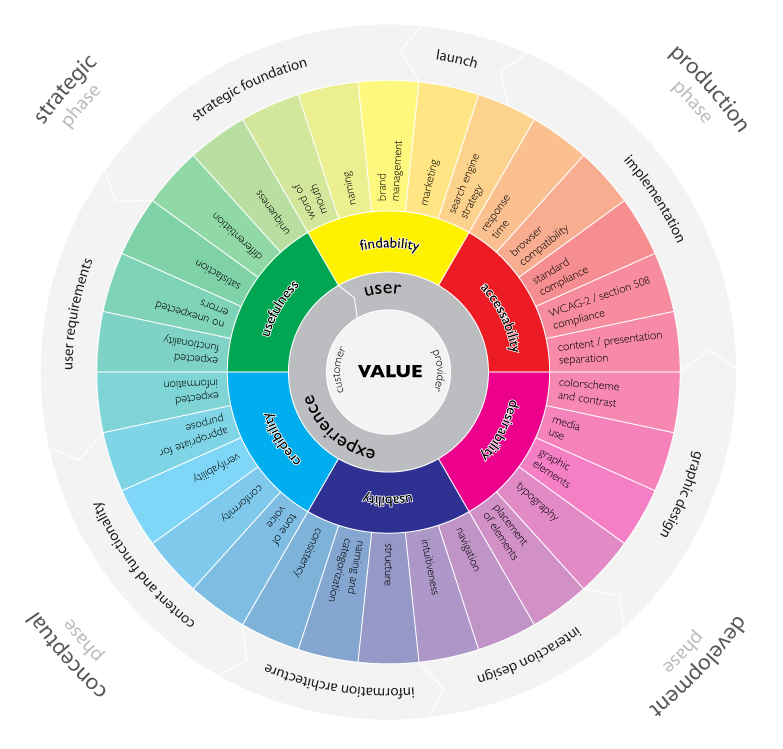
user_experience_wheelUser-Experience-Wheel

You can’t have it both ways. I mean, you might want to have it both ways, you might think that having it both ways, with some finagling, is possible, even though you know that one might, inevitably, cancel the other out, still you can’t have it both ways.

I’m thinking about something I used to tell clients when doing design work, web or print…  I used to tell them about the ‘wants triangle’… that’s what I called it, somebody with a PhD in economics probably came up with it, but I heard it somewhere, picked it up and made it my own. It went something like this: ‘You can have it quick, you can have it cheap, you can have it good… but you can’t have all three, you have to pick two…’

Now, my argument about wanting both is binary, whereas this equation wasn’t. In both cases, though, client/organization/boss had to make a choice. And decisions, for the majority of us upright bipeds, are things of the greatest difficulty.

So, you can’t have it both ways.

That’s the preface.

When we talk about having it both ways what we’re talking about is making the choice between choosing to adopt UX practices or not.

At this point, not adopting UX if you make websites, software, or really any product that somebody has to use, which, I guess, is almost everything from dishwashers to urinal pucks doesn’t make a lot of sense. Admittedly, safety was never a primary concern for most automobile manufacturers, and when safety standards were finally adopted, these rules had to be foisted upon automotive manufacturers; hard to imagine, now, I know, but alas, that was the case… Cars and safety belts go together like peanut butter and jelly. Similarly, the discipline of UX is kind of inseparable from the reality that users are going to use your stuff… so why not include them in the design process of the thing you’re making. Capital idea!

And yet…

You can’t have it both ways. Well, not exactly, but with maturity you can get pretty close.

I’m talking about the initial adoption and investment in UX, which does slow down the traditional process of the CEO or CMO telling you what kind of website or product they want and telling you to go and make it. The discipline of UX builds in layers that could be construed as slowing things down, but really this investment takes the risk out of something not working or being a flop when it eventually gets released or goes to market… the visionary CEO or CMO’s approach doesn’t. Admittedly, they’ll take the hit (sometimes), but it’s  a huge waste and a bummer to bet the farm on single person’s idea.

Achtung! Or, warning!, for our non-German speakers… In the cult of Steve Jobs, of which there are many supplicants, the idea of being a CEO, CMO or product person that has both business acumen and a strong vision is a very common occurrence, in some ways it feels like a plague… Business acumen, you can learn, vision, on par with Henry Ford, Thomas Edison, Walt Disney and Steve Jobs, uhh… yeah, not so much. Is it genius? I don’t know. There was something going on with these folks, their particular epochs, their experiences and also their locations on history’s timeline, intersecting with technology, curiosity, creativity and sheer force of will… the likes of which can’t be manufactured, thus making the likelihood of running into someone like this or your CEO being one of these people very, very slim. Which brings us back to UX.

UX is for the rest of us, i.e. most of us. UX takes practice, organization and structure, that’s why it’s called a discipline. That’s what is so enduring about it. It’s not a quick shot or injection that will make everything good. It’s transformative and transformation is hard; it’s change. It’s putting the users in charge of the design instead of the CEO, CMO or chief whatever officer… where it should be.

This is what I mean when I say you can’t have it both ways. You can’t have a mature UX practice and process in place without putting in the work. You can’t remove the risk of bad design without a mature UX practice.

You can’t have it both ways.

There’s no shortcut to a mature UX practice.
There’s no shortcut for good design.
There’s a symbiosis where each needs the other.

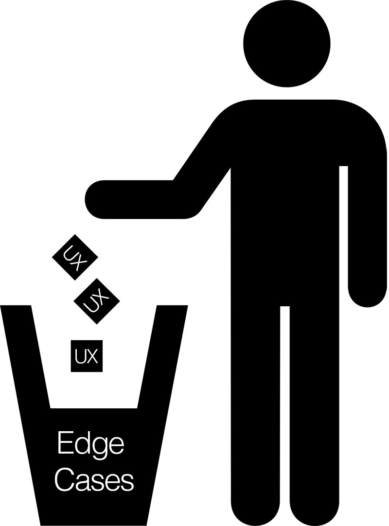
Don’t lose your UX to edge cases

ux_edge-cases

Vital to any user experience are the use cases, but sometimes, it is possible to overthink the design, the product, the software, the website, etc… We’re natural born problem solvers, so when we get in that state of mind it’s easy to find a lot of problems that need solving. The problem here is that we can lose ourselves and our user focus in edge cases.

Edge cases are important and play a vital role in determining how outliers and users in the minority might use your design, but we have to play to the 80/20 design rule: Focusing on the needs of 80% of your users.

That’s not to say that we don’t keep track of that 20% minority, or that we don’t capture use cases and put them in our product backlog, but we can’t prioritize edge cases as if they’re critical to making a design “complete”, when they ultimately prolong the shipping of the design.

Shipping the design gets us valuable user input that’s key to a product evolution and refinement, so getting lost in edge cases not only compromises the timeline, but ultimately focusing on edge cases compromises the user experience for the majority of users.

Focus on the needs of the majority of users, apply the 80/20 rule and design the user experience for the majority of users.

Meet me there… UX design and the user environment

user_experience_environment

User experience design requires an empathic, user-centered design perspective.

You have to meet people where they’re at.

Once you’ve completed your user interviews, and finished your personas, use-cases and journey maps, you have to really get inside the mind of the user.

One of the most difficult tasks of the UX designer is trying to not just get in the mind, but also the physical space of where the user experience is happening. Is it a loud manufacturing facility, is it a cramped commuter train, or is it a quiet health facility?

Knowing where the user experience is happening, getting a sense of that environment, even visiting, if at all possible, is the best way to ensure that the user experience is being designed, not just for the right kinds of users, but also for the right kinds of environments. We do it for different mobile devices, screen resolutions and browsers; why wouldn’t want to also design for the physical space?

The short answer is that we would.

Being an empathic and user-centered UX designer means that you have to capture as much as you can about the user, how and where, they interact with your design — The physical environment shouldn’t get any less consideration than any of the other design criteria.